Brand guidelines, assets, and product visuals for press and partners.
We’ve created the following guidelines to help partners, press, and the community accurately and consistently represent the LLMboost brand, without requiring individual approvals for standard usage.
Consistent naming helps people recognize and reference the brand correctly.
LLMboost should always be written as a single word, with LLM in uppercase and boost in lowercase.
Correct
Incorrect
When referring to specific features or components, treat them as proper nouns and capitalize them accordingly if you choose to name them (e.g., “LLMboost Analyzer”, “LLMboost Insights”).
The magnifying-glass symbol is a core element of the LLMboost identity.
LLMboost Isotype
Use for avatars, icons, and small placements.
Usage rules
Recommended uses
The primary logo should be used whenever possible.
Primary Logo (White Background Only)
Use this as the main logo. Works on white / very light backgrounds only.
Rules
Blue Background Logo
Use this version specifically for blue brand surfaces.
Rules
Primary blue, paired with white, and a yellow accent used sparingly.
LLMboost Blue (Primary)
RGB 38, 103, 230
#2667E6
LLMboost White
RGB 255, 255, 255
#FFFFFF
LLMboost Yellow (Accent)
RGB 245, 200, 66
#F5C842
Usage notes
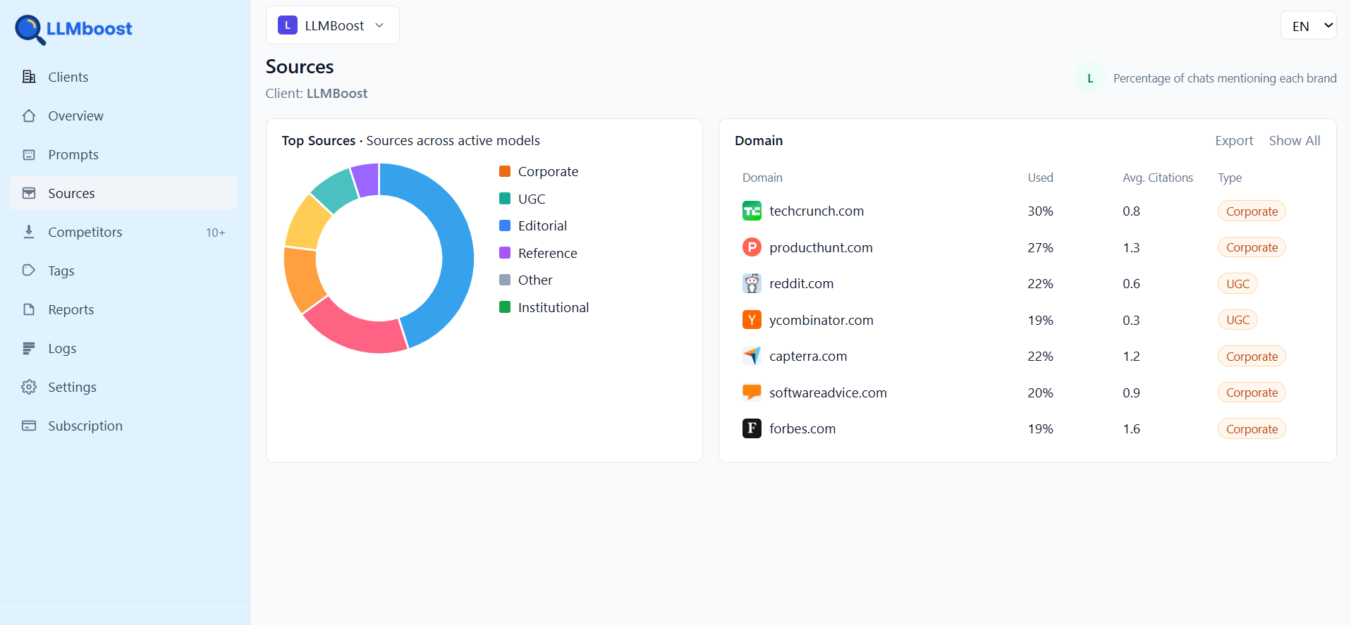
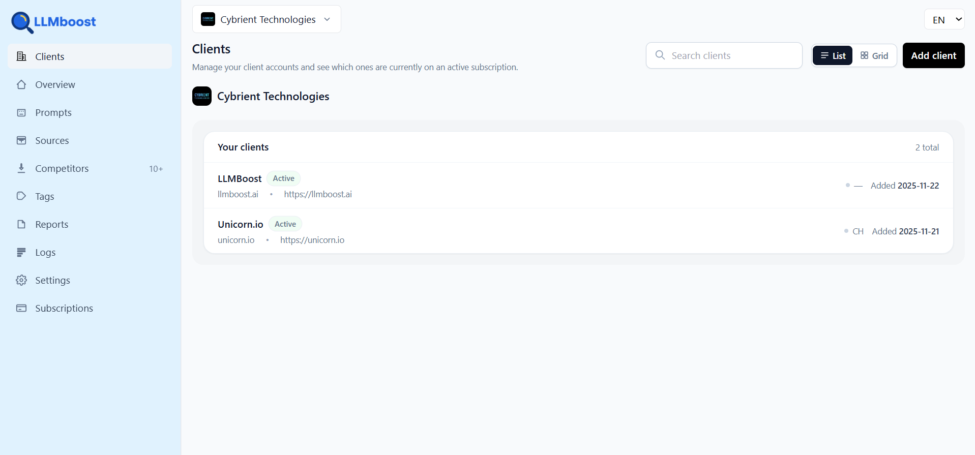
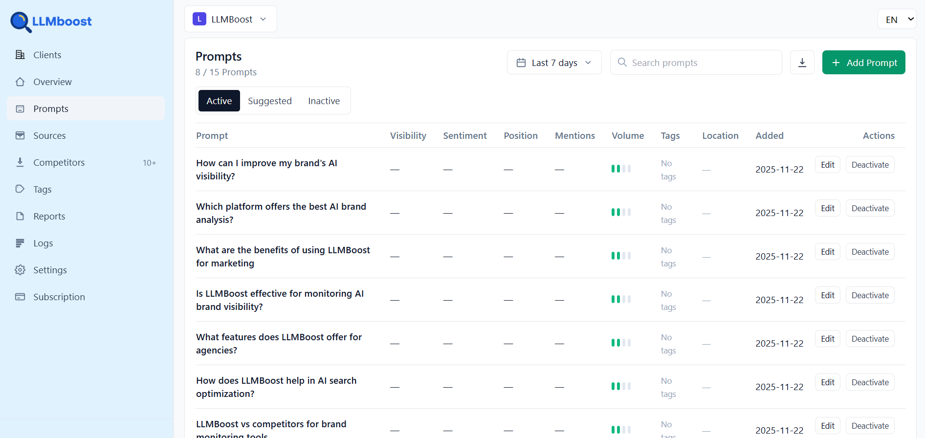
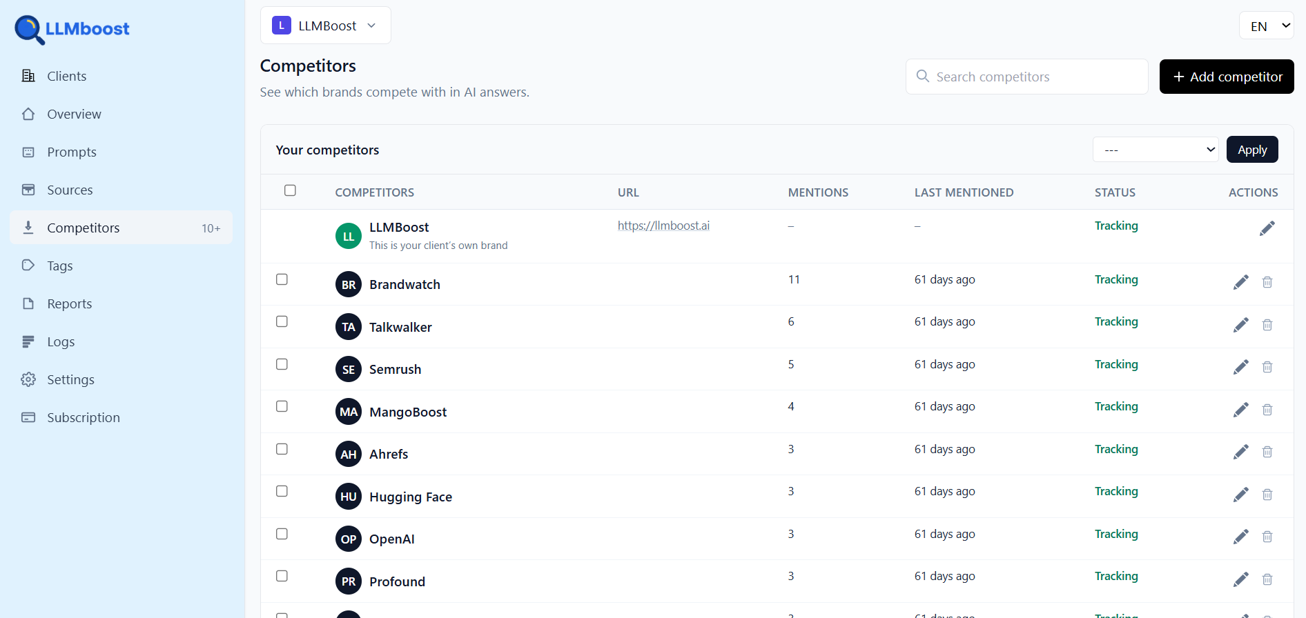
High-quality product screenshots and UI visuals for press and marketing use.
Use clean, up-to-date UI screenshots. Avoid sensitive data. Do not alter UI colors or branding.
Quick reference for which asset to use in common scenarios.
White background
Use primary logo
llmboost-logo.png
Blue background
Use blue version
llmboost-logo-white.png
Icon / avatar
Use isotype
llmboost-icon.png
Press contact (optional)
For press inquiries, send an email to [email protected].
While you’re optimizing for Google, millions are switching to ChatGPT, Claude, and Perplexity for recommendations. Don’t let competitors win the AI game.